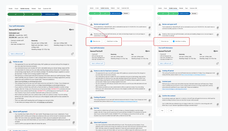
I created this experience as part of British Gas's transition from Classic to NEP (New energy platform), this project focused on improving the agent experience for changing customer energy tariffs. The starting point was an existing developer-built version which was being used by agents. The journey provided the information needed for customers to make an informed decision, but could take an agent up to 45–60 minutes to complete.
Challenge
The current agent experience is increasing operational costs. Long and complex tariff-change journeys are driving up cost per contact, reducing agent capacity, and limiting the number of customers served each day, impacting both efficiency and scalability.
Customer need
Customers want to change their tariff quickly and confidently when speaking to an agent by phone or chat. They need clear, transparent information about available plans, pricing, and terms, without confusion or unnecessary delays.
Service vision
Design a seamless, end-to-end service that empowers agents with the right information at the right time, enabling faster conversations, clearer recommendations, and smoother tariff changes.
My contribution
I was responsible for the Service Design and UX activities across this part of the project. My work included:
- Researching and observing agents using the existing service, to understand the customer and agent needs
- Identifying service pain points and opportunities
- Mapping the current experience
- Understanding the business rules behind tariff and payment combinations
- Exploring the future-state service
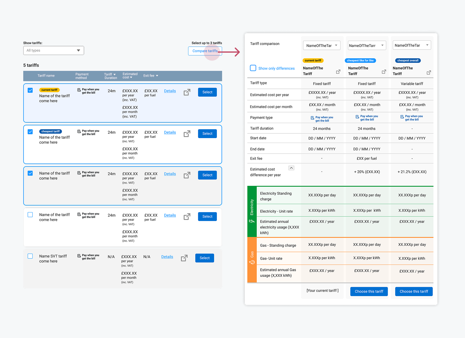
- Designing the guided agent journey and interaction patterns for tariff information and comparison
- Testing concepts and iterations with agents, and analysing feedback to translate it into service improvements
- Working with compliance, legal and technology teams to understand constraints
- Identifying opportunities for reusable agent patterns and components, and contributing to the direction of a wider agent design system
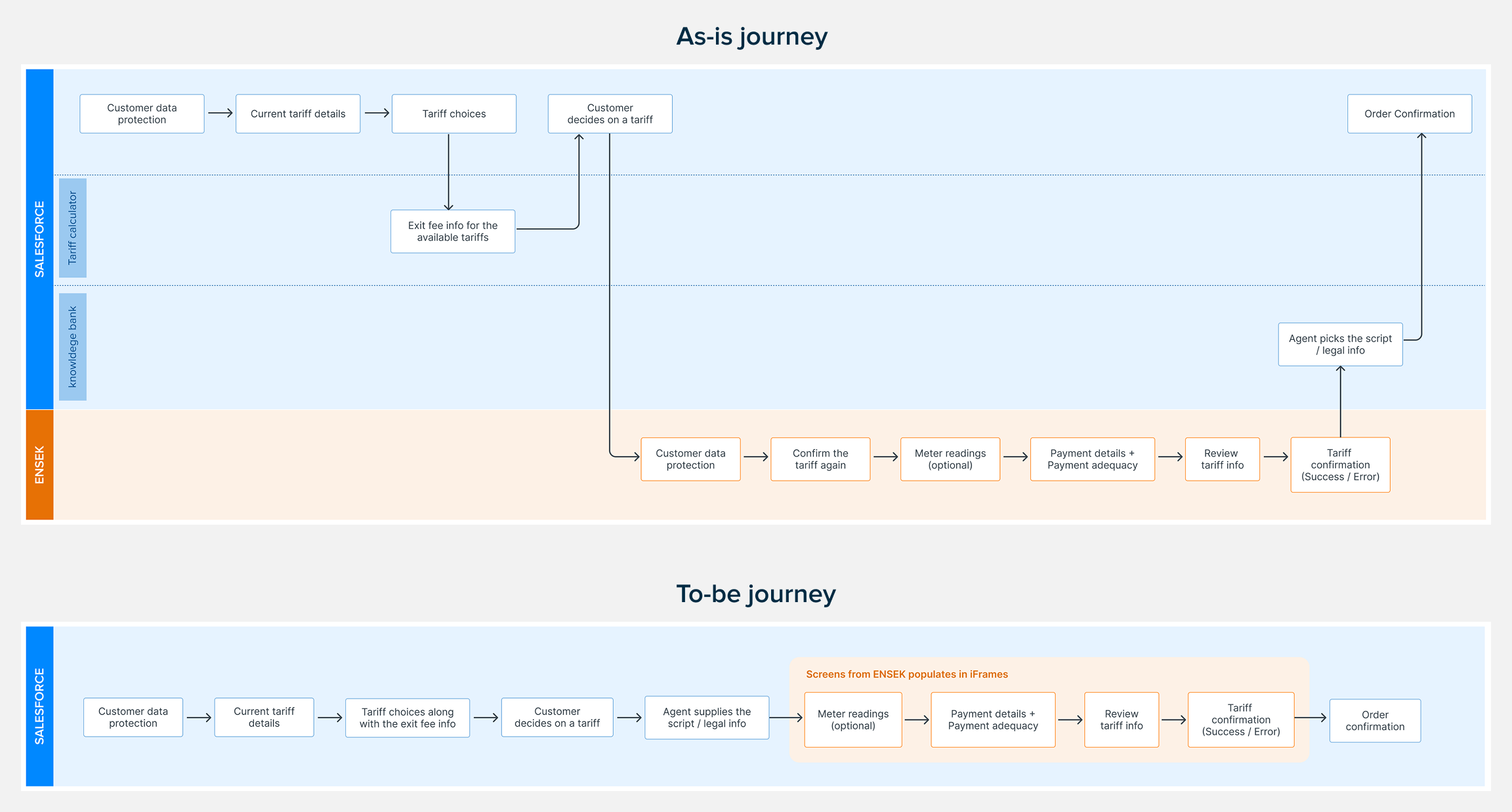
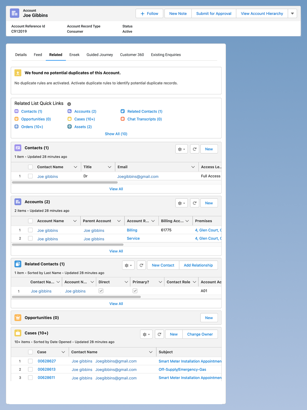
In the as-is journey, the agent has to navigate across different areas of Salesforce and ENSEK to gather the information needed to help the customer make an informed decision. This fragmented process increases the time and effort required to complete the journey.
In the proposed journey, we simplified the experience by bringing everything together into a single, streamlined flow, enabling agents to access the right information more efficiently.
Understanding the current service
Moderated online sessions with agents and engineering team.
I ran moderated online sessions with agents and asked them to walk me through how they handled real tariff-change scenarios, and with the engineering team to understand the limitations with the current system and what can be done as a quick win.
In these sessions I observed them working through the process. This helped me understand the difference between the intended journey and what actually happened in practice.
Identified several key pain points:
- Information was fragmented across Salesforce, ENSEK, Knowledge Bank, and the Tariff Calculator
- Agents had to manually copy and reformat information for customers
- The journey didn't support all tariff-change scenarios
- Tariff information wasn't always consistent or up to date
- Legal and contractual information interrupted the customer conversation.
This showed me that the problem wasn't just the number of screens. The service needed to better support agent knowledge, customer conversations, information, rules and technology together.
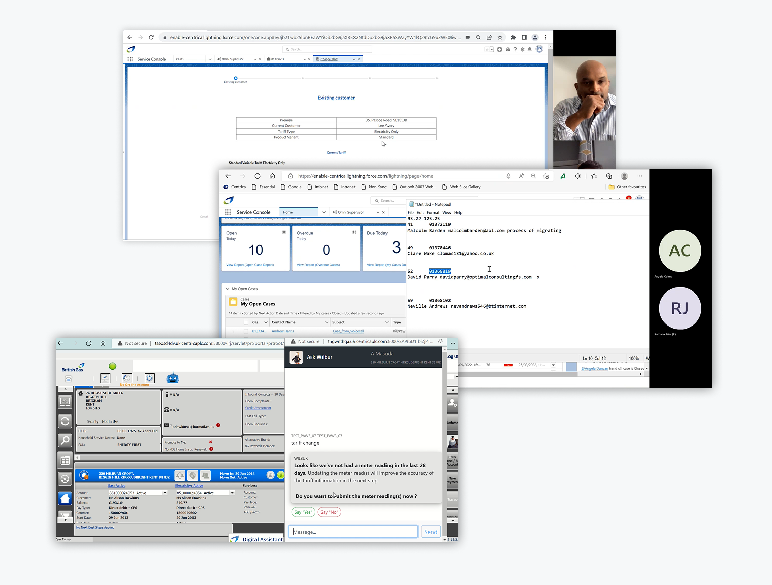
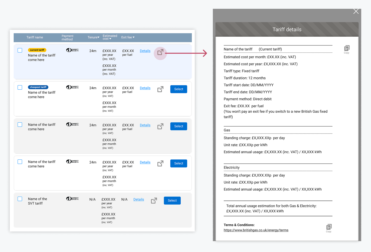
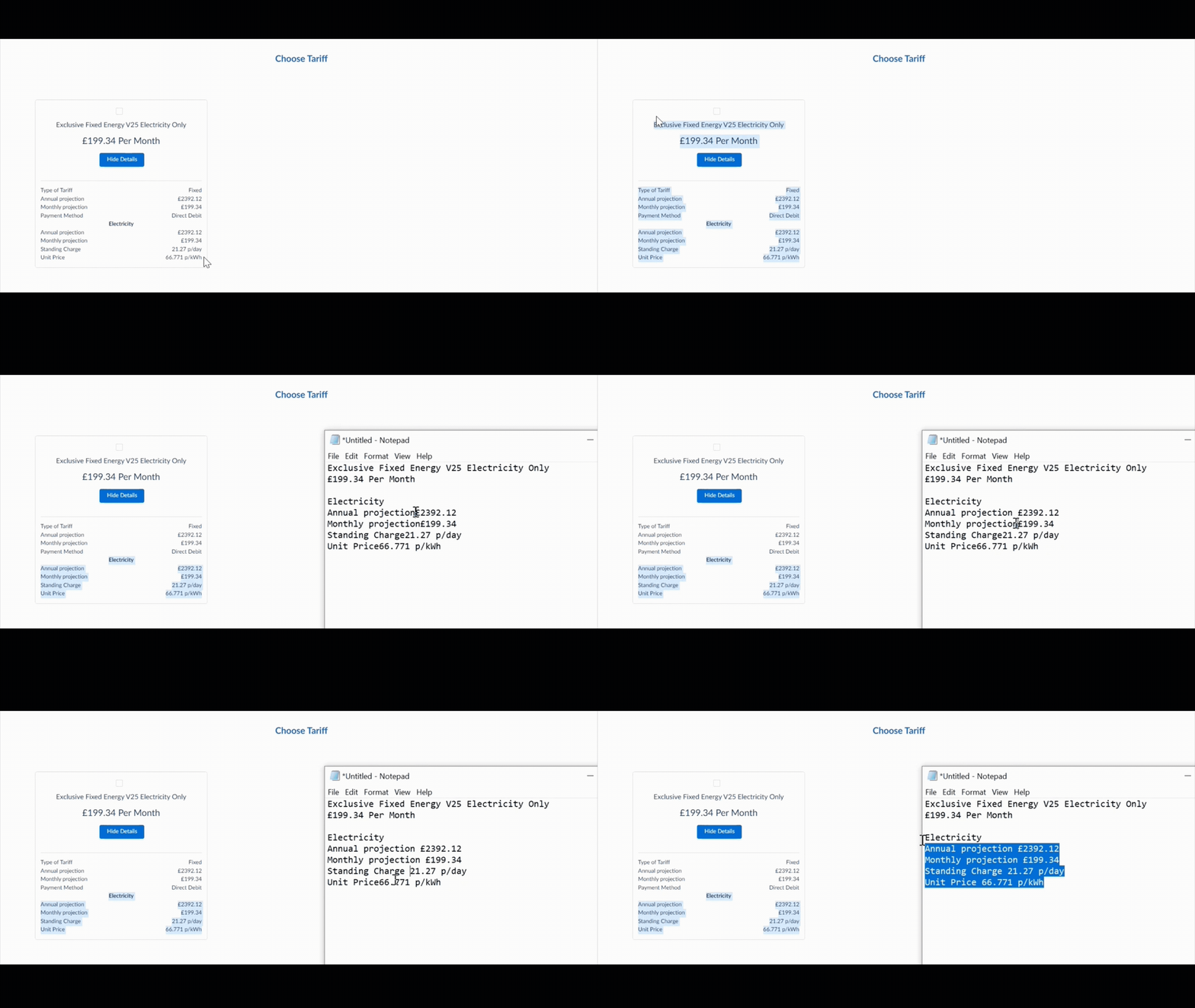
To share tariff information with a customer, agents previously had to copy the information into a text editor, format it, and then paste it into the chat window. This was a time-consuming task and added unnecessary effort to the conversation.
I suggested triggering an overlay containing the relevant information in a pre-formatted, plain-text format. This allowed agents to simply copy the content and paste it directly into the chat, reducing the effort needed to prepare and share tariff information.
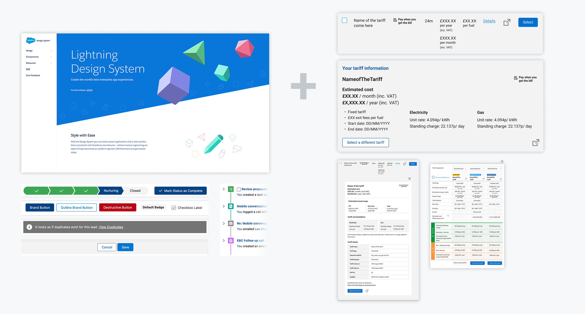
The experience was built in Salesforce, using Salesforce Lightning components alongside custom patterns I designed for tariff cards, comparison, information and copying.
As the service expanded across different teams, another challenge emerged: teams were creating their own versions of components. This led to an opportunity for a dedicated Agent design system, bringing reusable patterns and components from tariff changes, renewals, cancellations, and other agent journeys into a shared foundation.
Our first version
Below is the selected list of screens designed for our first version.
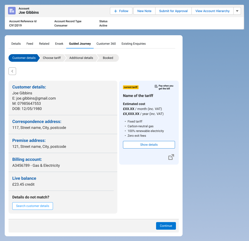
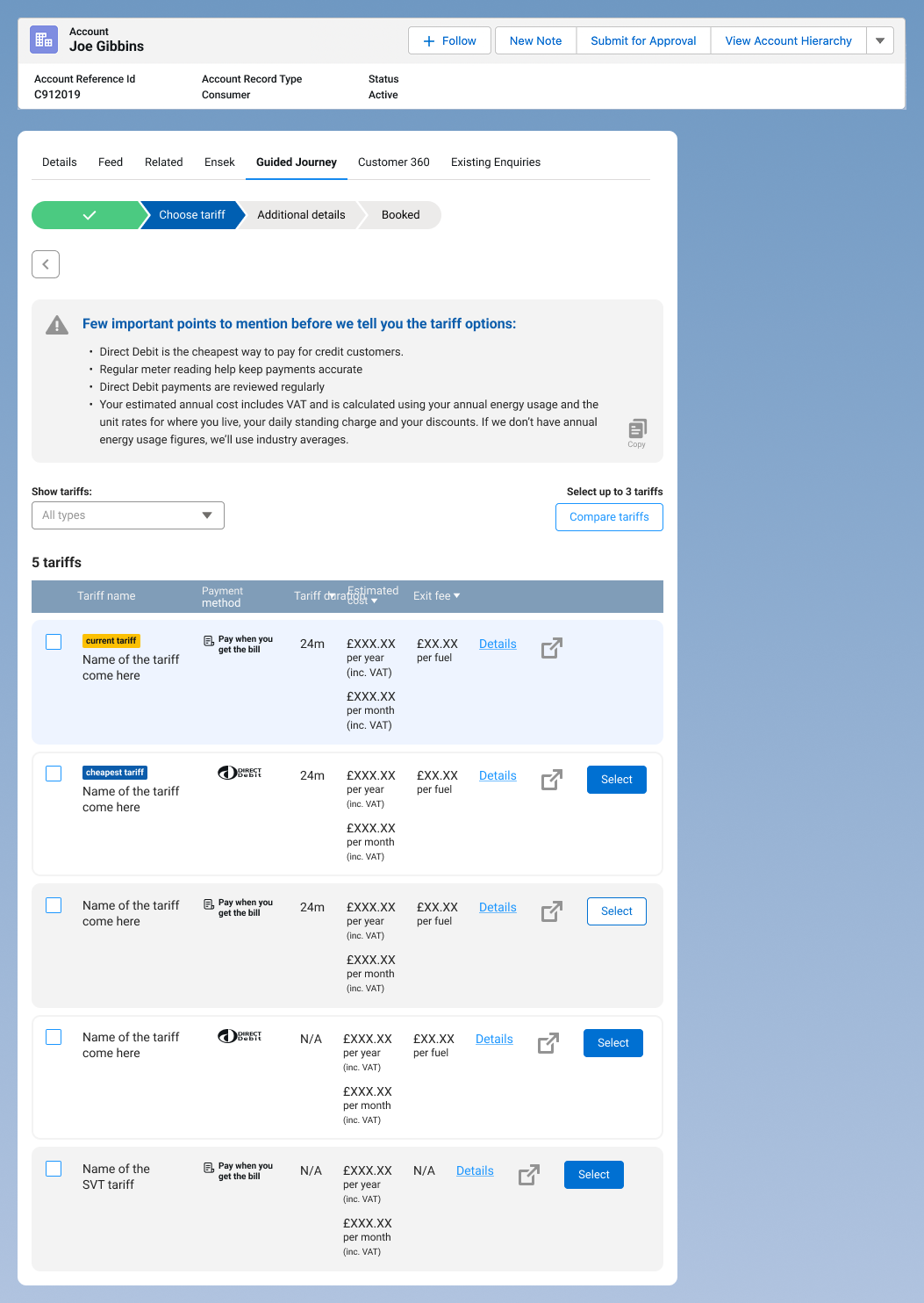
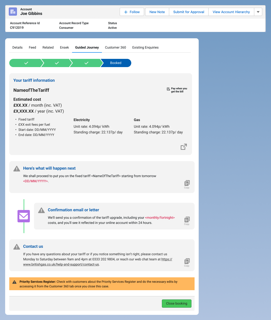
I tested the first version with agents to understand whether the new approach actually made their work easier. The feedback was positive around having information available in one place. However, testing also exposed new opportunities.
- Agents were very happy to have all the information available in one place and felt that the journey was more seamless. However, filtering tariffs within the Comparison feature was still a constraint in the first release, and this remains an issue.
- Newer and more experienced agents used the platform differently, particularly during voice conversations
- Although the ‘Copy’ functionality worked, agents felt the action needed to be more prominent.
- There was a significant amount of legal content within the journey. Agents told us that many customers did not want to hear all of this information during the conversation. They often preferred to receive the contractual information afterwards.
These findings helped us focus the next iteration on how the service supported the conversation, rather than simply refining the interface.
- I brought the information agents needed directly into the journey, rather than requiring them to leave the experience and search for it elsewhere. For example, when a customer selected a Standard Variable tariff with Direct Debit, the relevant information was dynamically pulled from the database based on the tariff, payment method and energy type selected. The information changed accordingly for Fixed tariffs and for Electricity or Gas.
- Designed a Copy feature to make it easier for agents to share tariff information with customers. Clicking the link opened an overlay containing the relevant information in a clean, plain-text format. Agents could simply select, copy and paste the content into the chat without having to format it themselves. I've provided two versions of it:
- Minimum information about the tariff.
- Complete information about the tariff.
- Once the customer selected a tariff, the relevant tariff information remained available to the agent throughout the rest of the journey. This meant agents could return to the information and copy or share it with the customer whenever needed.
Iterating the experience
List of changes we have implemented from the feedback we received from our first version.
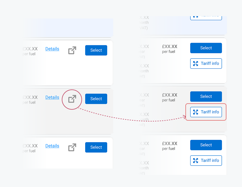
During testing, I found that the icon used to open the tariff information modal was not immediately clear to agents.
To make the action more visible and easier to understand, I introduced a secondary button within each tariff card. This gave agents a clear and recognisable way to access the relevant tariff information when needed.
Rather than automatically presenting a long block of legal information, I explored giving the customer more control. The agent could ask: 'Would the customer like to receive the contract information now or later?'
- If the customer said they wanted it immediately, tthe full information was made available for the agent to copy, paste, or explain.
- If the customer preferred to receive it later, the agent could continue without going through the full legal section, but the customers will receive the information through post or email.
- Every iteration was reviewed with internal compliance and the external legal team to make sure the experience remained compliant.